
Roy Lichtenstein used Ben-Day dots because they made the construction of an image visible. In a comic book, the dots helped turn a limited range of inks into convincing colour and tone. Enlarged in his paintings and prints, they became something the viewer could hardly overlook. A face could still convey longing or distress, even as its skin resolved into an orderly pattern.
This relationship between the image and the means used to create it runs throughout Lichtenstein’s work. The dots connected painting to commercial culture, challenged assumptions about artistic expression and gave him an adaptable way to describe the world. Their significance becomes clearer when we move beyond recognising the style and look closely at what they do.
What are Ben-Day dots, and where did the technique originate?
The Ben-Day process was developed in 1879 by Benjamin Henry Day Jr., an American illustrator and printer. It offered a practical solution to a commercial problem: how to give printed illustrations a convincing range of tones and textures without the expense of engraving every detail individually.
Day’s system used prepared patterns that could be transferred onto a printing surface. These included dots, parallel lines and other textures. Printers could apply them selectively to introduce shading, distinguish materials or create areas of colour within an illustration.
Dots proved particularly useful. Small marks of coloured ink, distributed across white paper, could merge in the viewer’s eye into an apparently continuous tone. Red dots against white could suggest pink skin; overlapping patterns could extend the range of colours available from a limited selection of inks.
The technique belonged to a wider development in illustrated newspapers, advertising and commercial publishing. As printed images reached larger audiences, economical methods of reproducing tone became increasingly important. Dot patterns became closely associated with the appearance of inexpensive colour comics.
Ben-Day patterns should be distinguished from photographic halftones. In a conventional halftone, dots vary in size to reproduce the tonal changes of a photograph. Ben-Day patterns supplied prepared areas of texture or tone that could be added to an image. Both helped translate visual information into printable marks, but they did so through different methods.
Lichtenstein encountered the results as part of everyday visual culture. His intervention was to enlarge and reinterpret a convention that readers generally looked through rather than at. A device intended to make reproduction economical became a prominent feature of an artwork.
His dots were therefore deliberate artistic adaptations. He adjusted their scale, placement and relationship to outlines and flat colour, turning a practical printing convention into a means of exploring how images are constructed and understood.

Why did Ben-Day dots matter in the early 1960s?
Lichtenstein’s breakthrough coincided with a culture increasingly organised around advertising, consumer goods and mass-distributed imagery. Comics and commercial illustrations were part of everyday visual experience, yet their familiarity helped keep them outside the established hierarchy of serious art.
By bringing their conventions into painting, he questioned that hierarchy. The issue extended beyond whether a comic-book character was an acceptable subject. It concerned the standards by which an image was judged: why did one kind of mark suggest artistic achievement while another was dismissed as merely functional?
Abstract Expressionism provided an immediate context. Its varied practices had helped establish the painted gesture as a powerful indication of an artist’s presence. Lichtenstein had himself worked with abstraction before developing his mature Pop style.
The evenness of his dots proposed a different kind of surface. They suggested something repeatable and impersonal, associated with a commercial process rather than an individual emotional outpouring.
Nevertheless, the artist’s judgement remained essential. Decisions about cropping, scale, line and colour became especially consequential when expressive handling was restrained. The work required viewers to look for invention within a visual language they thought they already understood.

How did Lichtenstein make his Ben-Day dots?
The mechanical appearance was carefully constructed. In 1961, Lichtenstein experimented with pushing paint through the holes of a plastic dog-grooming brush after its bristles had been removed. He also tried a small aluminium stencil with hand-drilled holes.
By 1962, he was using an industrial perforated metal screen. This helped him create more regular patterns, although their application still belonged to the making of a painting.
The distinction becomes important in front of an original canvas. Reproductions can suppress the adjustments and material qualities through which Lichtenstein achieved his apparently manufactured finish. The picture looks reproducible, yet its surface records an extended process of selection and execution.
His editioned prints introduce another relationship between method and appearance. In a screenprint, the dots are printed through prepared screens. An image that evokes commercial reproduction is therefore made through a repeatable process, but within the controlled conditions of an artist’s edition.
Comparing paintings and prints shows how precisely Lichtenstein understood the possibilities of different media. The same graphic vocabulary could produce materially different experiences.

What does Reverie reveal about Lichtenstein’s dots?
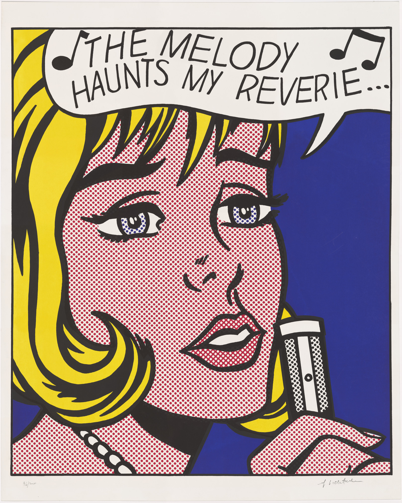
Reverie offers an especially rich example because its emotional effect survives our awareness of its artificial construction.
The 1965 screenprint brings a blonde woman close to the viewer. Her yellow hair, dark outlines, dotted complexion and blue surroundings form clearly differentiated areas. The raised hand, parted lips and musical notation suggest a woman singing, absorbed in the feeling carried by a melody.
The cropped composition leaves little room for a setting or explanatory narrative. Attention gathers around the face and the fragment of song above it.
The dots play a double role. They provide a convention for representing skin while remaining unmistakably patterned marks. From a distance, we respond to the woman’s expression. Moving closer, we become more conscious of the system that makes her appear.
This movement between recognition and inspection is central to the print. The regular pattern allows very little of the variation through which a traditionally modelled portrait describes a particular complexion. Yet the image still conveys intimacy and emotional absorption.
It also draws on an idealised type: the glamorous heroine familiar from romance comics. Her appearance belongs to a shared commercial vocabulary of beauty and feeling. Lichtenstein gives that vocabulary enough space and precision for us to examine its persuasive force.
The result can accommodate both affection and irony. The sentiment is recognisable, perhaps even seductive, while the devices presenting it are unusually exposed. We can be moved by the image and conscious of its conventions at the same time.
Reverie is documented as Corlett 38 and belongs to 11 Pop Artists, Volume II. Made in 1965, it appears in MoMA’s record as published in 1966, in an edition of 200 alongside proofs. Those details locate it within Lichtenstein’s early engagement with the artist’s print as a substantial work in its own right.
How does the use of Ben-Day dots change the way we read action and emotion?
A comparison with Sweet Dreams, Baby!, also made in 1965, demonstrates the range of this apparently restricted language.
Where Reverie holds us close to a face, Sweet Dreams, Baby! compresses the action around a striking fist and a partially visible figure. Dotted flesh, emphatic contours and lettering make the encounter immediately readable.
The pattern has a different effect in this setting. Across an image of violence, its orderly repetition creates a tension with the force of the action. The scene is abrupt and physical, yet everything has been organised into a controlled arrangement of shapes.
Drowning Girl, the 1963 painting, offers another variation. Its source was a page illustrated by Tony Abruzzo for the romance comic Secret Hearts. Lichtenstein cropped away the boyfriend and capsized boat, leaving the woman isolated within the surrounding water. He also edited the wording.
These changes make the image more concentrated and less narratively complete. The dots retain its association with printed entertainment while its scale and isolation invite a different kind of scrutiny.
Acknowledging Abruzzo matters. The invention of the source illustration and Lichtenstein’s transformation of it are both part of the work’s history. His changes do not settle the questions of authorship and credit that appropriation raises; they give us specific decisions through which to examine them.
What happens when the brushstroke becomes an image?
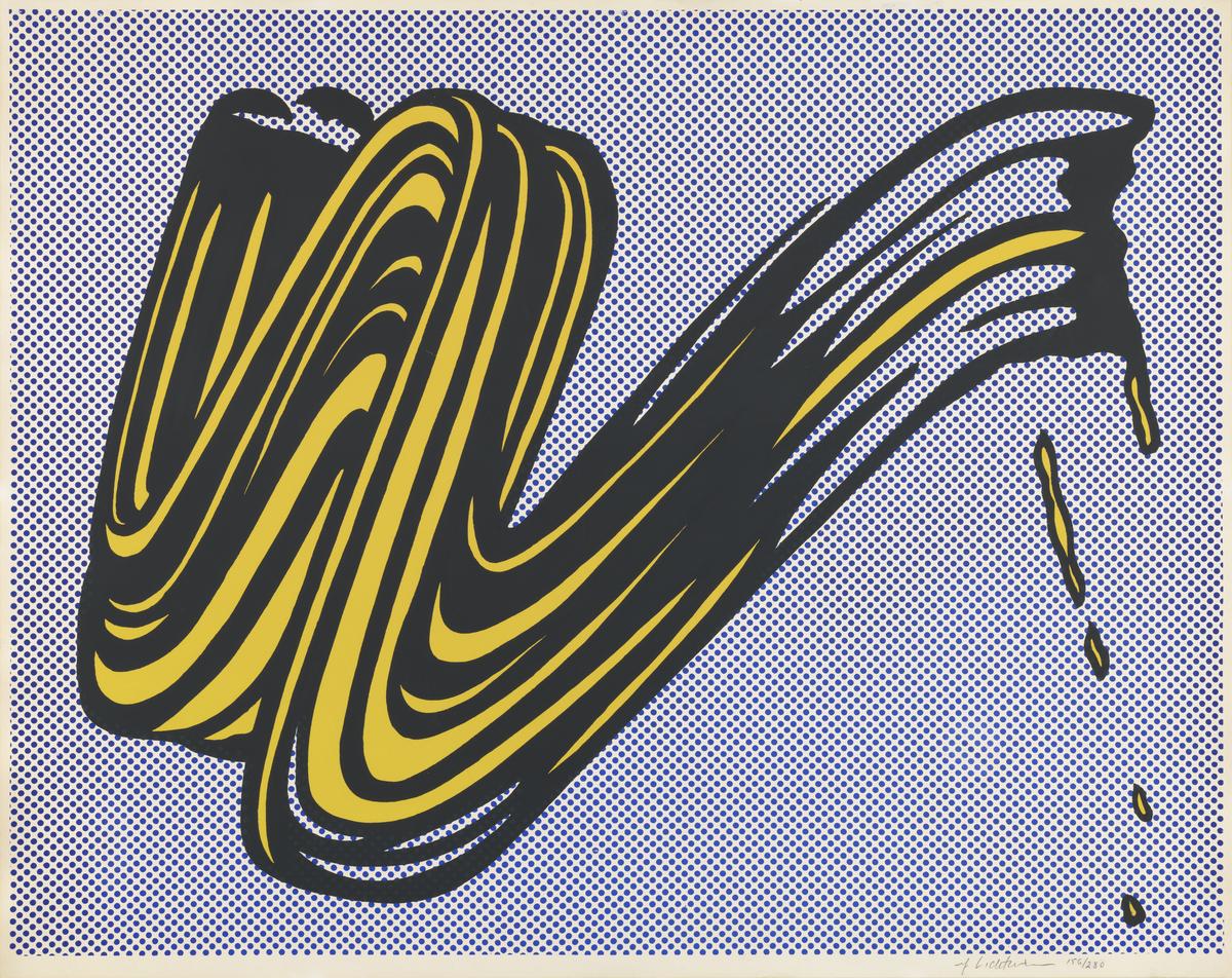
Lichtenstein’s Brushstroke of 1965 turns from comic-book emotion towards the conventions of painting itself.
A yellow sweep, outlined in black and accompanied by apparent drips, sits against a field of blue dots. It resembles the trace of a rapid physical gesture, but that gesture has become a carefully bounded image.
The dotted background makes the contrast particularly clear. The brushstroke and its surroundings belong to one controlled graphic construction. Even the apparent spontaneity of dripping paint can be described through a repeatable visual sign.
This introduces a productive complication into the familiar opposition between Pop Art and Abstract Expressionism. Lichtenstein could study the expressive brushstroke, enjoy its shape and question its authority within the same work. His treatment made a supposedly direct mark available for representation and reconsideration.
How did Lichtenstein’s use of Ben-Day dots develop in the Nudes series?
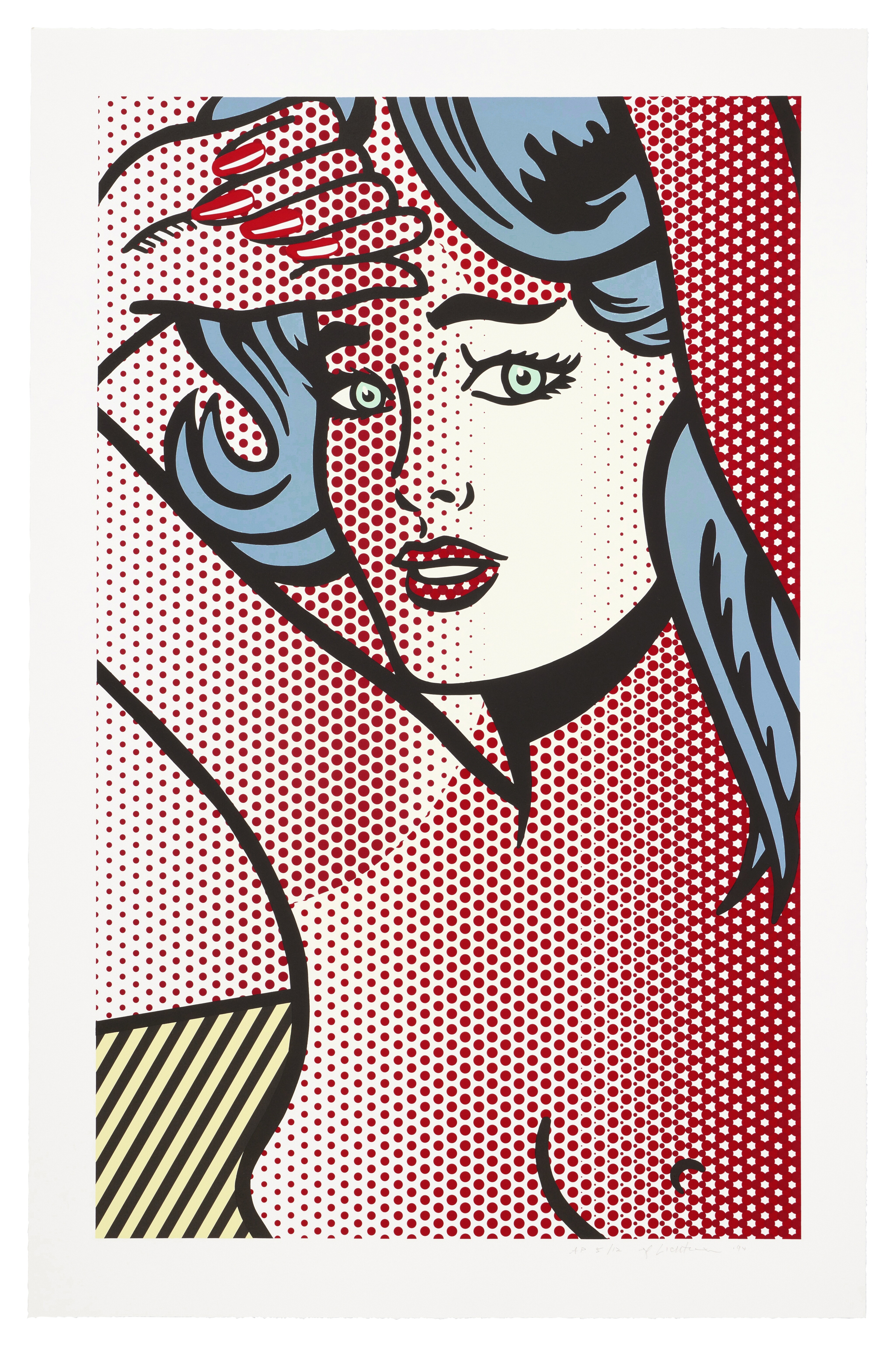
Lichtenstein returned to the women of romance comics in his Nudes series of 1994. These figures connect directly with his early Pop imagery, but their treatment shows how far his pictorial language had developed.
The women were adapted from printed illustrations rather than drawn from live models. Lichtenstein reimagined clothed comic-book heroines as nudes, bringing the visual conventions of popular entertainment into contact with one of the most established subjects in Western art.
This decision introduced a different set of expectations. The traditional painted nude offered artists an opportunity to describe flesh, volume and the effects of light through carefully graduated colour. Lichtenstein approached those possibilities through outlines, patterned dots and areas of flat colour. The body became a meeting point between the conventions of painting and those of reproduction.
His treatment of the dots was particularly significant. They could move across several forms, extending between the figure and its surroundings rather than remaining contained within the outline of an individual object. A passage of pattern might suggest shadow while also asserting itself as a flat arrangement across the sheet.
The resulting space is deliberately ambiguous. The eye recognises bodily volume, then encounters a pattern that seems to disregard the body’s boundaries. The figure appears to advance and recede as these different ways of reading the image compete.
Lichtenstein had explored variable-sized dots before the Nudes. The development here lies in how freely he used them to connect forms and unsettle their separation. Discussing the work with David Sylvester in 1997, he related this approach to chiaroscuro: shadow offered a way to join the figure with whatever surrounded it.
How do the late Nudes compare with Reverie?
Placing Reverie beside the Nudes reveals continuity as well as change.
In Reverie, the dotted complexion is clearly distinguished from the yellow hair and blue background. The pattern helps establish the woman’s face as a separate, legible form. Her expression and the fragment of song supply the emotional focus, while the dots keep the commercial origins of the image visible.
The Nudes complicate that relationship between a figure and the space around it. A contour may identify the body, but the pattern does not always respect the division it establishes. Dots can describe flesh and simultaneously connect it to another part of the composition.
This gives the late work a different visual rhythm. In Reverie, attention gathers around a tightly cropped face. In the Nudes, it moves between the body, furnishings and patterned surroundings. Recognising the subject becomes part of a more extended negotiation of space.
Nude with Blue Hair, a 1994 relief print documented as Corlett 286, also provides a useful technical comparison. Reverie is a screenprint; the later work was produced with Tyler Graphics using assembled relief plates. Their shared graphic clarity emerged from distinct methods and decades of experimentation.
The contrast helps explain why Lichtenstein continued to find possibilities in his dots. An early device for evoking commercial reproduction became an increasingly flexible means of organising perception. The familiar style remained recognisable while the relationships within it grew more intricate.
Why do Lichtenstein’s Ben-Day dots still reward close looking?
Following the dots from Reverie to the Nudes changes our understanding of Lichtenstein’s achievement. Their consistency can initially suggest a fixed formula. Closer attention reveals how substantially their function changes.
In Reverie, they help construct an idealised face whose emotion remains persuasive despite its visibly artificial surface. In Sweet Dreams, Baby!, their regularity sits against the abrupt force of physical action. In the Nudes, they introduce uncertainty into the relationship between the body and its surroundings.
For collectors, these differences make comparison especially rewarding. A dotted surface can establish tone, interrupt an illusion or connect otherwise separate forms. The question is what the pattern contributes to the particular work.
Lichtenstein’s sustained interest in dots was therefore more than a commitment to a recognisable signature. Across three decades, he continued to test how a simple graphic unit could make an image convincing—and make us conscious of the act of looking.
For more information on Roy Lichtenstein prints for sale, or to discuss selling your Roy Lichtenstein print, contact our team at info@alexyellop.com.