
Claude Monet spent years painting the same pond at Giverny without exhausting what there was to see. He could make the Japanese bridge the centre of a picture, then leave it out altogether and let a few water lilies tell us where we were. By the time Roy Lichtenstein took up the subject in 1992, the pond was one of the most familiar places in art. That made it a good subject for an artist who liked to find out how differently a familiar image could be seen.
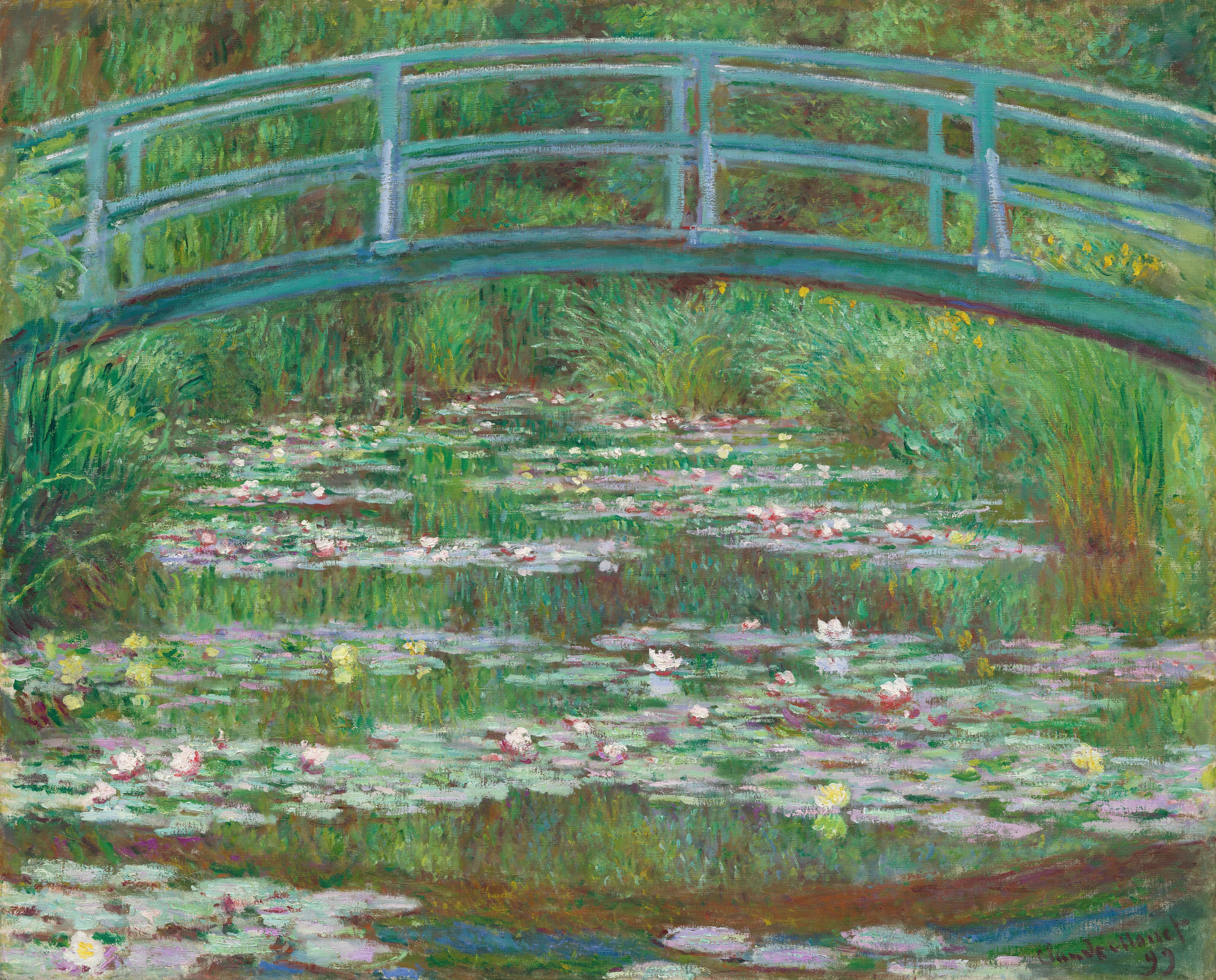
For Lichtenstein, there was a difficulty that hadn’t been there with comic strips. A comic already came with outlines and flat areas of colour; much of what makes Monet’s pond so absorbing is the way one colour runs into another. It’s hard to say exactly where the reflected trees end and the water begins. Across the six works in his Water Lilies series, Lichtenstein gave those shapes much clearer edges. What’s surprising is how much of the uncertainty he managed to keep.
Monet’s garden in the language of Pop
In Water Lilies with Japanese Bridge, the arch is the first thing that places us at Giverny. Once we’ve recognised it, we’re willing to accept a row of stripes as a disturbance on the water or a patch of colour as foliage. The bridge gives Lichtenstein the freedom to be quite abrupt elsewhere in the picture. He can put one shape hard against another and trust that we’ll read them as parts of the same garden.

That’s a different experience from looking at Monet’s paintings of the bridge. With Monet, the longer you look, the more colour you find in what at first seemed to be a single area of green or blue. With Lichtenstein, the longer you look, the more you notice how often the same kinds of marks are asked to do different jobs. A stripe can suggest a ripple in one part of the picture and simply divide one area of colour from another elsewhere. We move between seeing the pond and seeing how few marks it takes to make one.
The comparison also shows why Monet was such a good choice for Lichtenstein. It would have been easy to make a joke out of giving an Impressionist painting the look of a comic strip. The print is more interesting because it lets us see something about both artists: Monet could make a scene feel coherent without defining every object, and Lichtenstein could give us sharply defined shapes without settling exactly what they represent.

Looking down into the sky
Monet’s later views of the pond often left out the bridge and the banks. Once the edge of the water is gone, there’s very little to tell us which way we’re looking. The lilies are floating on the surface, but the sky and trees seem to extend underneath them. It’s possible to spend quite a while with one of those paintings before noticing that it contains a view of the sky without a horizon.
Lichtenstein picks up on that ambiguity in Water Lilies with Cloud. The title makes the cloud sound like an ordinary feature of a landscape, although in the context of the series it invites us to look for the sky in the water. Compare that with Water Lilies with Japanese Bridge: one gives us a landmark and lets us make sense of the scene around it; the other asks how much of a landscape we can recognise when the usual landmarks are gone. There’s a good reason to look at the works together. What seems like a simple change of subject is also a change in where the viewer stands and what they can see.

The reflection that isn’t printed
The effect is clearest in Water Lily Pond with Reflections. Lichtenstein and the team at Saff Tech Arts left parts of the worked stainless steel exposed, so the light in the room could change how those areas looked. The printed shapes remain where they are, but something that stood out a moment ago can recede as you take a step to one side.
Lichtenstein remembered seeing those swirled patterns on the metal dashboards of old cars. It’s an unlikely detail in the story of a work about Monet, and a revealing one. He found a way to suggest the pond’s movement in something he remembered from everyday life. The steel does just enough to make the eye hesitate over whether it’s seeing a reflection in the picture or a reflection on the picture.

That effect also helps explain why photographs give only a partial sense of the works. A photograph can show the design clearly, sometimes more clearly than a first look in a room, but it has to fix the light at one moment. When comparing two works from the series, a view from an angle can show why a section that seems quiet in a straight-on photograph turns out to be one of the most active parts of the print.
From the Haystacks back to the pond
Lichtenstein had first worked through Monet’s use of repetition in his 1969 Haystack series. The difference between the bright yellow Haystack #1 and the dark Haystack #7 is easy to see side by side: the stack remains recognisable, but the conditions in which we seem to see it have changed. What makes the Water Lilies distinctive is that the change can happen while we’re still looking at the same work.

It’s tempting to look for Monet in the bridge and Lichtenstein in the dots, but the most interesting part of the series is where that distinction gets harder to make. Lichtenstein understood that the appeal of Monet’s pond lay partly in how difficult it was to get a settled view of it. He changed almost everything about how the pond was pictured and found a way to make that experience his own.
For more information on Roy Lichtenstein prints for sale, or to discuss selling a Roy Lichtenstein print, contact our team at info@alexyellop.com.