
Ed Ruscha’s Standard Station turns a petrol station into a monument. Its sharply angled canopy drives across the image, the red lettering commands attention, and the building appears almost too precise to belong to an ordinary roadside. A place designed for a brief stop becomes an image that holds the eye.
Its importance lies in that transformation. Ruscha brought together the American road, commercial design, cinema and language in a composition that could develop across photographs, paintings and prints. Standard Station offers one of the clearest introductions to his art: immediately recognisable, formally sophisticated and open to interpretations that extend well beyond its apparently straightforward subject.
Where Did the Image Come From?
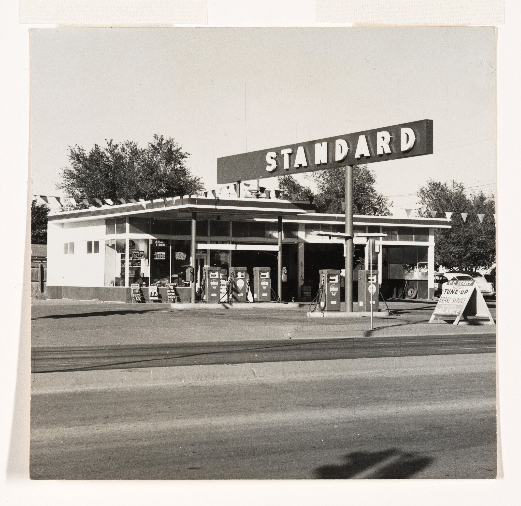
The starting point was a real Standard service station in Amarillo, Texas. Ruscha photographed it in 1962 during the journeys he made between Los Angeles and Oklahoma City, where he had grown up. The photograph appeared in Twentysix Gasoline Stations, his first artist’s book, published in 1963.
The book’s modest format matters. Its black-and-white photographs and plain captions presented roadside buildings with little of the drama usually associated with landscape imagery. These were functional places, familiar to anyone who travelled by car. Ruscha made their repetition into a subject worth considering.
Photography provided more than preparatory material. The book was an artwork with its own logic, turning an ordinary sequence of petrol stations into an encounter with selection, organisation and the built environment. The Amarillo photograph subsequently became the source for a very different kind of image.
In Standard Station, Amarillo, Texas, painted in 1963 and now in the Hood Museum of Art at Dartmouth, the building stretches across a canvas more than three metres wide. The quiet roadside observation has become something commanding and theatrical.
How Ruscha Made the Ordinary Monumental
The difference between photograph and painting reveals how much Ruscha changed. He stripped away distracting details, intensified the perspective and gave the architecture an emphatic diagonal thrust. The canopy and sign advance towards the viewer while the building recedes into the distance.
Ruscha connected this effect to cinema, recalling shots in which a train approaches from a distant point until it fills the screen. The comparison helps explain why the station feels dynamic even though nothing in it moves. Its perspective supplies the action.
His experience in commercial art and graphic design informed the precision of its lines and lettering. Roadside architecture already competed for a driver’s attention; Ruscha sharpened that visual language until the structure became an image of extraordinary authority.
This makes Standard Station an important contribution to Pop Art. Ruscha found his subject in the commercial landscape of the American West, showing how advertising and architecture could shape an image as powerfully as a conventional view of mountains or countryside. Modern life had produced its own landmarks.
What Does “Standard” Mean?
The word above the building identifies the brand, but it also becomes a substantial part of the composition. The letters are architectural: they add weight, establish rhythm and reinforce the direction of the roofline. Reading and looking happen together.
That relationship anticipates the importance of text throughout Ruscha’s work. A word can communicate information while also operating as shape, colour and scale. Here, the name seems inseparable from the structure beneath it.
“Standard” also carries associations beyond the company. It suggests a norm, a measure of quality, or something repeated from place to place. Those associations create an intriguing tension. The business promises familiarity and consistency; Ruscha makes its building look exceptional.
The image leaves room for both admiration and unease. Its confident geometry and red, white and blue colouring can suggest optimism, mobility and American prosperity. The same immaculate structure can also prompt questions about an environment increasingly organised around corporate identities. Its appeal survives because those readings can coexist.
Why the 1966 Screenprint Matters
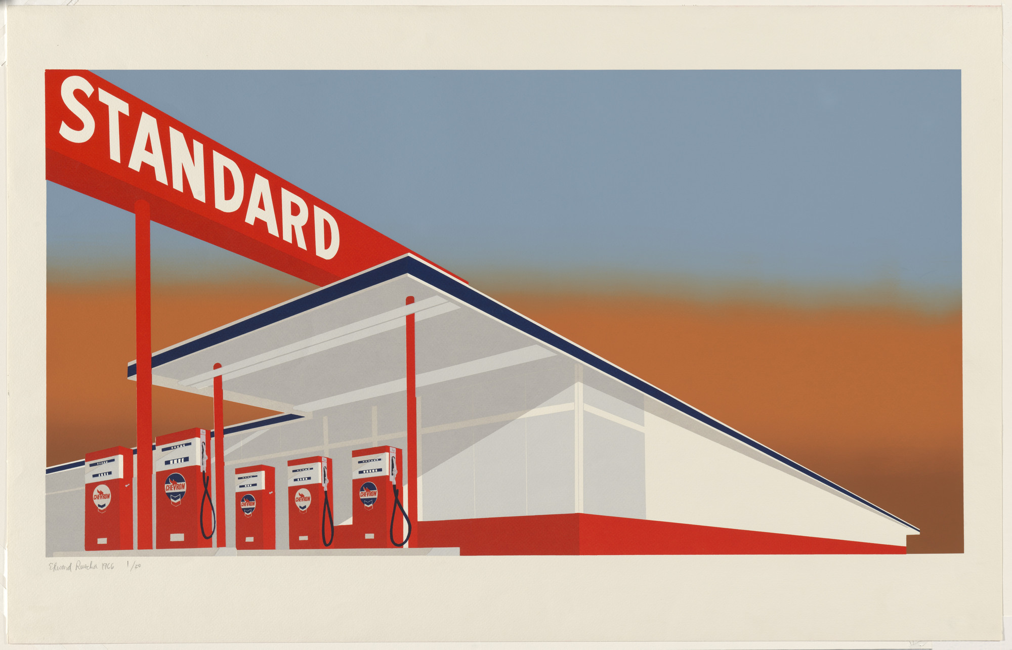
The Standard Station screenprint, made in 1966, extended the image’s possibilities. It should be understood as a distinct editioned work within Ruscha’s investigation of the subject, with its own treatment of colour, surface and atmosphere.
Screenprinting suited the architecture’s crisp edges and uninterrupted areas of colour. For the sky, Ruscha used the split-fountain technique, combining different coloured inks within a screen to create a graduated transition. The shift between warm orange and cooler blue gives the building an atmospheric setting while preserving its graphic clarity.
The contrast is essential. The station appears fixed and sharply defined; the sky suggests changing light and an indeterminate moment. The result combines the instant impact of a commercial image with an atmosphere that is harder to place.
Published by Audrey Sabol, the 1966 print was issued in a numbered edition of 50, alongside proofs. It is recorded as Engberg 5 in the catalogue raisonné of Ruscha’s editions. Examples belong to collections including MoMA, LACMA and the National Gallery of Art in Washington.
Why Did Ruscha Keep Returning to It?
The later versions show that the composition could sustain substantial change. In Mocha Standard, made in 1969, browns and darker tones alter the image’s atmosphere. The architecture remains familiar, but its emotional character shifts.
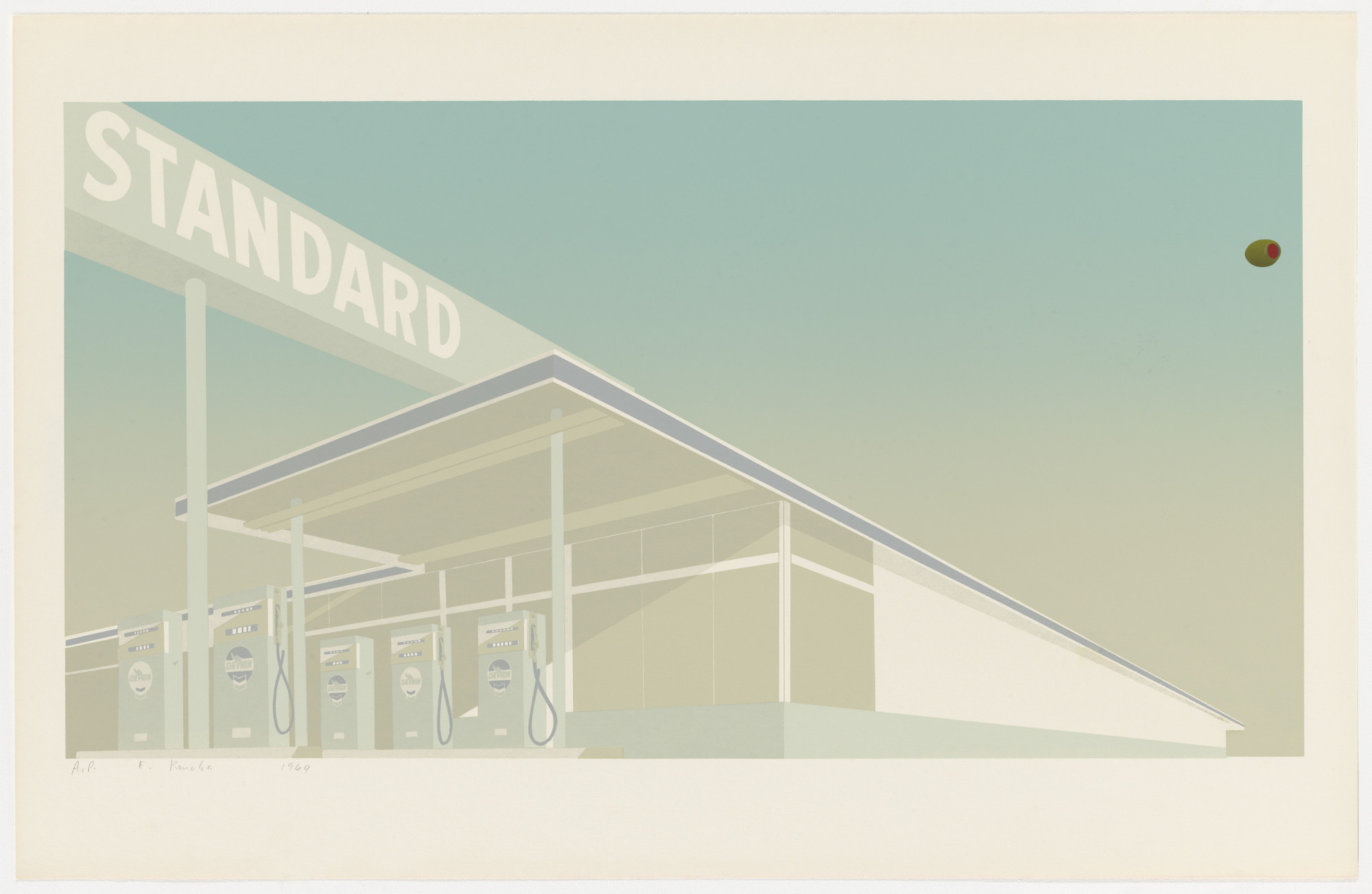
Cheese Mold Standard with Olive, also from 1969, introduces blue-green colouring and an incongruously domestic title. The association with food interrupts the grandeur of the structure, bringing Ruscha’s dry humour into the encounter.
Double Standard, made in collaboration with Mason Williams that year, introduces a second crossing sign. The title acquires a visual counterpart, making the relationship between words and forms more explicit.
Decades later, Ghost Station, created in 2011, removed colour altogether. The image emerges through the relief of embossed paper and the shadows across its surface. By then, the architecture could remain recognisable even when much of its original visual force had been withdrawn.
These works demonstrate the difference between repeating an image and continuing to investigate it. Colour, material and language each change how the station is experienced.
Why Standard Station Matters to Collectors
For collectors, the station imagery connects several of Ruscha’s central concerns within a single composition. It belongs to his exploration of photography and books, his engagement with commercial language, and his ability to make familiar American surroundings feel strange.
The individual editions deserve close attention. Their colours, techniques and edition structures differ, as does their visual presence. Understanding those distinctions is part of collecting Ed Ruscha prints, alongside examining condition, provenance and the quality of the particular impression.
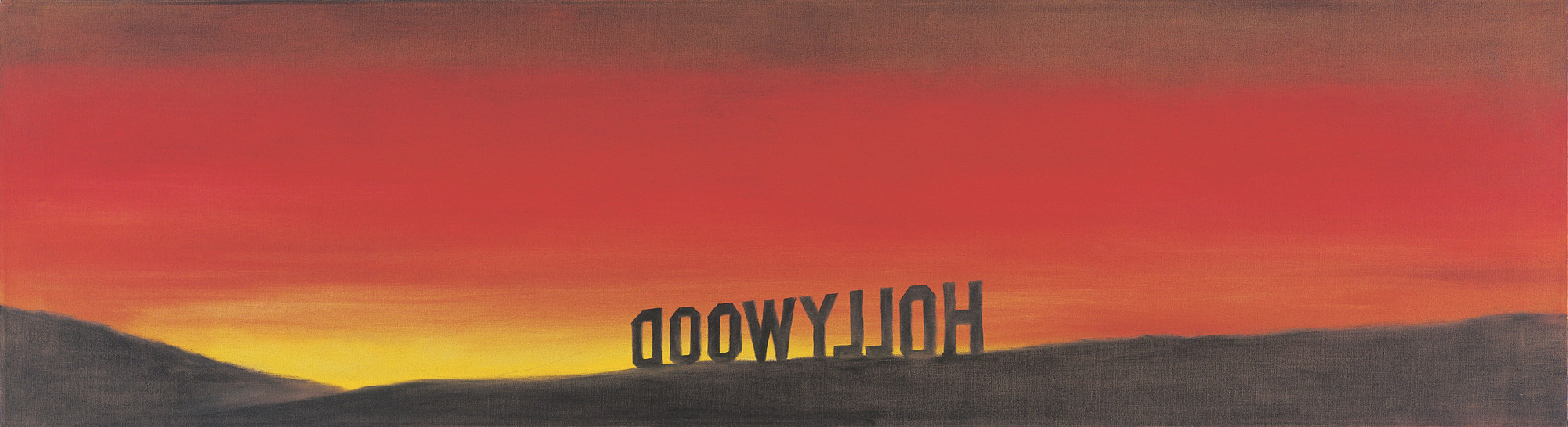
The image also provides a useful route into his Hollywood prints, where lettering and landscape again become inseparable. Across both subjects, Ruscha understood that signs do more than identify places. They help construct the way those places exist in our imagination.
That is the lasting achievement of Standard Station. Ruscha took a building made to be noticed briefly and gave it a presence that rewards sustained attention. Its subject belongs to the roadside; its questions reach into how images acquire meaning, familiarity and power.
For more information or to buy Ed Ruscha prints, please contact us. If you would like to sell Ed Ruscha prints, we would be pleased to discuss your work.