
A word can feel surprisingly different when it occupies an entire painting. Removed from a conversation, advertisement or familiar phrase, it begins to draw attention to things we usually overlook: the shape of its letters, the sound it makes and the associations it carries. Ed Ruscha recognised how much could happen within that encounter, making language one of the most enduring subjects of his art.
Across paintings, drawings and prints, Ruscha gives ordinary words an extraordinary presence, allowing them to appear monumental, humorous, seductive or faintly unsettling. His choices range from abrupt expressions such as OOF to ambiguous combinations including Bliss Bucket, whose familiarity encourages us to start reading before their strangeness makes us look again.
Understanding why Ruscha uses words begins with that relationship between recognition and uncertainty, through which something apparently straightforward becomes increasingly difficult to pin down.
How did words become Ruscha’s subject?
Ruscha’s interest in lettering developed through his experience of commercial art, printing and the American road. After moving from Oklahoma City to Los Angeles in 1956, he studied at the Chouinard Art Institute, where design and painting offered different possibilities for his growing interest in images.
Working with typography gave him a practical understanding of how letters were constructed and arranged, while the signs encountered on journeys between Oklahoma and California demonstrated their power at a very different scale. A word beside a highway had to register quickly, with its size, spacing and clarity contributing as much to its impact as the information it conveyed.
Ruscha began to recognise that these familiar arrangements of letters could become subjects for painting. His commercial training supplied the precision to handle them, while his attention to everyday surroundings provided an abundant source of material.
Within the context of 1960s Pop Art, this brought the language of public life into an arena traditionally associated with more elevated subjects, giving a roadside word or abrupt exclamation the space and attention afforded to a portrait or landscape.
Why were his early word paintings so direct?
In OOF, begun in 1962 and reworked in 1963, large yellow letters occupy a deep blue background, giving a brief, bodily expression the authority of a substantial painting. The word suggests an impact, an effort or the involuntary sound that escapes before someone has time to formulate a sentence.
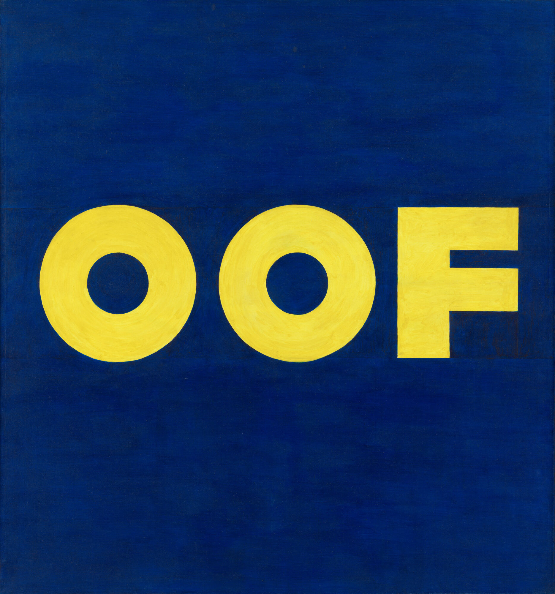
Ruscha described his early attraction to monosyllabic words in terms of their vocal power, indicating how closely the experience of seeing them could be connected with imagining their sound. Reading OOF brings an action or sensation to mind even though the painting supplies no figure, setting or explanation.
The deliberate handling of such an apparently throwaway expression introduces a humour that continues throughout his work. A fleeting utterance becomes something carefully considered and physically imposing, encouraging us to notice how much expressive force a few letters can contain.
Where does Ruscha find his words and phrases?
Ruscha has drawn on conversations, radio, books, films, advertising and dreams, selecting fragments that catch his attention through their sound, associations or peculiar choice of words. Once removed from their original circumstances, these phrases acquire an independence that allows them to suggest several possible stories.
His 1976 drawing Pretty Eyes, Electric Bills brings together romantic attraction and the ordinary demands of household expenditure, producing a combination whose appeal rests in the distance between its two subjects. We understand both phrases immediately, yet their appearance together creates a relationship that takes longer to absorb.
Literature has provided more extended material, including the passage from J. G. Ballard’s High-Rise used in The Music from the Balconies in 1984. Set over a tranquil landscape, the text’s reference to sporadic violence unsettles the scene, demonstrating how words can transform an image without changing anything depicted within it.
Other combinations offer fewer clues to their origins. In History Kids, the two words stretch across a mountain beneath an intensely coloured sky, inviting associations with generations, memory and the past without establishing a definitive relationship between them.

How does Ruscha’s lettering affect meaning?
Typography influences how a word seems to speak, with differences in weight, spacing and construction suggesting authority, informality, urgency or restraint. Ruscha’s attention to those qualities allows the appearance of a phrase to complicate what it seems to say.
From around 1980, he began using a typeface he called Boy Scout Utility Modern, whose squared-off curves and practical construction give the lettering an apparently neutral character. That measured presentation becomes particularly effective when the words themselves are unexpected, as their composure lends an air of certainty to statements whose meaning remains elusive.
In Bliss Bucket, the crisp white capitals give equal prominence to a state of perfect happiness and an ordinary container. Their matching treatment encourages us to accept the pairing momentarily, before the contrast between the words begins to register.

The pleasure comes partly from that delay, as the lettering presents a phrase with enough confidence to make its oddity feel almost reasonable.
What happens when the letters become liquid?
Ruscha’s interest in words has also involved changing their apparent physical properties, allowing lettering to resemble substances that might spill, bead or lose their shape. During the late 1960s, his liquid-word paintings offered an alternative to the rigid edges associated with printed type, making language seem susceptible to gravity and movement.
That approach is evident in Made in California, a lithograph whose lettering appears to have formed from liquid against a vivid orange ground. The phrase recalls a label identifying a product’s place of manufacture, while its glistening appearance gives it a tactile quality that invites associations with the state’s sunshine and produce.

The distinction between depicting an unusual substance and printing with one is important within Ruscha’s practice. In the 1970 portfolio News, Mews, Pews, Brews, Stews & Dues, he used organic mixtures as printing media, bringing material experimentation together with a sequence of rhyming words.
Through these different approaches, language becomes something we can imagine touching or hearing as well as reading, extending its presence beyond the conventional function of delivering information.
Why does Ruscha place words over mountains?
Ruscha’s mountain prints create another productive encounter by bringing the grandeur of alpine scenery into contact with phrases that can sound casual, commercial or unexpectedly domestic.
The mountains provide an immediate sense of scale and drama, drawing on imagery familiar from travel advertising, postcards and cinema. Against that setting, words acquire an importance that may seem disproportionate to what they actually say, while their presence interrupts the possibility of simply admiring the view.
In Bliss Bucket, the blue mountain landscape lends the first word an almost plausible setting, while “bucket” introduces a decidedly earthbound association. The phrase can suggest an extravagant promise of happiness, with the ordinary noun quietly interfering with the elevation supplied by the scenery.
Looking between the text and landscape allows each to alter the other, creating an experience that develops through attention. Ruscha gives the viewer enough information to begin forming connections while leaving their significance open.
How do signs change when they become artworks?
Signs usually belong to situations in which their purpose is clear, whether identifying a business, directing traffic or advertising something for sale. Ruscha’s work makes that apparent clarity more complicated by moving their words into circumstances where the practical explanation falls away.
In Dead End 1, made using the Mixografía process on handmade paper, the weathered appearance evokes a sign exposed to years of use. Encountered as an artwork, the familiar warning can suggest a stalled ambition or an exhausted possibility, extending its implications beyond the road.

His earlier landmark subjects explore related territory, as the lettering in Standard Station becomes integral to the building’s commanding presence, while Hollywood carries expectations far beyond its location. Our articles on the significance of Standard Station and Ruscha’s recurring Hollywood imagery examine how these names help shape the places they identify.
Across such works, Ruscha makes us more attentive to language that familiarity might otherwise allow us to pass over.
Do Ruscha’s words have a hidden meaning?
Ruscha has welcomed different interpretations of his work, acknowledging that a word can suggest different things even to him on separate occasions. That openness helps explain why his images remain engaging after their text has been read and remembered.
A phrase may initially seem amusing, then become disquieting through a change in association, while attention to its colour, placement or surroundings can alter its character again. Viewers bring their own experiences to this process, giving familiar language a capacity for renewal.

For someone considering a work, spending time with that changing response can be particularly revealing. Reading the words aloud, looking at the image from a distance and returning to its details may disclose qualities that an immediate reaction misses, complementing the practical considerations discussed in our guide to collecting Ed Ruscha prints.
The enduring appeal of Ruscha’s word art lies in the care with which he turns recognition into curiosity, allowing language we encounter every day to become a source of sustained attention, humour and surprise.
To enquire about Ed Ruscha prints for sale, or to discuss selling an Ed Ruscha print, contact our team at info@alexyellop.com.