
Keith Haring used his art to confront issues that affected the people around him, from racism and homophobia to drug addiction and the devastation of HIV/AIDS. His bold figures and bright colours helped those messages reach an audience far beyond galleries, appearing on posters, clothing and public walls where people could encounter them in everyday life.
The accessibility of his work was central to its purpose. A passer-by could recognise a confrontation, understand a gesture or respond to an appeal without knowing anything about contemporary art, allowing Haring to address difficult subjects with exceptional directness.
Across his anti-apartheid prints, AIDS-awareness campaigns and community projects, Haring developed a practice in which making images and taking action became closely connected. Understanding that commitment reveals the urgency behind some of his most familiar works.
From the Subway to the Street
Haring’s interest in public communication developed through the chalk drawings he began making in New York’s subway stations in 1980. Working on the black paper covering unused advertising panels, he placed his figures where commuters would see them during their daily journeys, discovering how quickly an image could attract attention and invite a response.
The experience helped him develop a style in which posture, scale and relationships between figures could carry considerable meaning. A body restrained by another suggested a different encounter from two figures supporting one another, while the marks surrounding a mouth or limb could communicate aggression, movement or energy.
As our article on the meaning of Keith Haring’s symbols explores, these recurring images acquired significance through their changing combinations. Their familiarity gave Haring a way to introduce increasingly direct social concerns while retaining the immediacy that had first drawn people to his work.
Free South Africa: Drawing the Fight for Freedom
Haring’s Free South Africa prints, made in 1985, addressed apartheid through an encounter between two figures whose relative sizes expose the imbalance at the heart of the system. A small white figure attempts to control a much larger black figure, turning racial oppression into a relationship the viewer can grasp almost immediately.

The difference in scale makes the image particularly forceful, presenting the authority of the oppressor as something maintained through restraint despite the greater physical presence of the person being controlled.
In Untitled 3 (Free South Africa), the action unfolds across two panels as the larger figure’s movement overturns that relationship. The smaller figure loses its footing and falls, giving resistance the directness of a sequence in a comic strip.
Haring also circulated the anti-apartheid imagery through posters, extending its reach beyond the limited editions. Reproduction allowed a forceful composition to become a public appeal, connecting his printmaking with the international campaign against South Africa’s system of racial segregation.
Silence = Death: The Cost of Looking Away
The AIDS crisis gave particular urgency to Haring’s activism as friends, collaborators and members of his community became ill and died. His work addressed both the disease and the prejudice, fear and failures of public response that compounded its effects.
In Silence = Death, 1989, silver figures cover a black ground and a large pink triangle, with their hands obscuring eyes, ears and mouths. Their gestures suggest the refusal to see, hear or speak about what is happening, making silence appear as an active choice with consequences.

The title and triangle connect the work with the wider AIDS activist movement. The Silence = Death emblem had been created by the Silence = Death Project and adopted by ACT UP before Haring incorporated it into his own imagery, adding his figures to an existing campaign.
His separate 1989 poster, Ignorance = Fear / Silence = Death, published by ACT UP, concentrates the message into three yellow figures beneath the opposing statements. The familiar gestures associated with “see no evil, hear no evil, speak no evil” become an accusation against avoidance and indifference.
Haring’s own AIDS diagnosis in 1988 made these concerns intensely personal, although his involvement in awareness and advocacy had begun earlier. His images encouraged viewers to recognise that silence could protect stigma and delay action when information, care and public pressure were urgently needed.
Love in the Face of Prejudice
Haring’s response to homophobia included an open affirmation of gay life, intimacy and sexual freedom, giving pleasure and affection a place alongside the anger and mourning of his AIDS-related work.
His 1989 mural Once Upon a Time, painted at New York’s Lesbian and Gay Community Services Center for an exhibition marking the twentieth anniversary of the Stonewall uprising, celebrates sexual liberation while recalling a period before the AIDS epidemic. Its exuberance carries the weight of what had been lost, preserving desire and physical connection as subjects worthy of public expression.
A quieter sense of solidarity appears in Untitled (Two Figures with Red Heart), 1987, where two figures stand together beneath an oversized heart. One places an arm around the other’s shoulders, giving the familiar emblem of love a gesture of companionship and support.

The print leaves their relationship open, allowing different viewers to recognise their own experiences within it. Seen in the context of Haring’s life and activism, that openness also affirms the dignity of affection at a time when gay relationships faced widespread hostility.
Crack Is Wack: A Warning on the Wall
With Crack Is Wack, painted in 1986 on a handball court wall in East Harlem, Haring addressed the crack epidemic through a short phrase and a composition designed to register in public space. The vivid orange ground and animated black outlines made the warning visible to people passing through the neighbourhood and along the nearby roadway.
Its position mattered because the message occupied the city in which the consequences of addiction were being experienced. Haring used a familiar recreational structure to reach an audience that included young people, making the mural part of the surroundings through which they moved.

The project also exposed the awkward relationship between public art and official permission. Haring initially painted without authorisation, and after the original mural was covered, the Parks Department invited him to create another version with the same theme.
The mural’s history demonstrates how an unsolicited intervention could become a recognised public landmark, while its direct wording gave Haring’s concern a memorability that helped the message endure.
A Human Chain Across Berlin
In October 1986, Haring took his commitment to public art to the Berlin Wall, painting a long chain of interlinked figures near Checkpoint Charlie at the invitation of the Checkpoint Charlie Museum.
Using black and red against a yellow ground, he drew on the colours of the German flag to suggest a connection between people separated by the border. The linked bodies occupied a structure whose purpose was division, giving the composition a significance inseparable from its location.
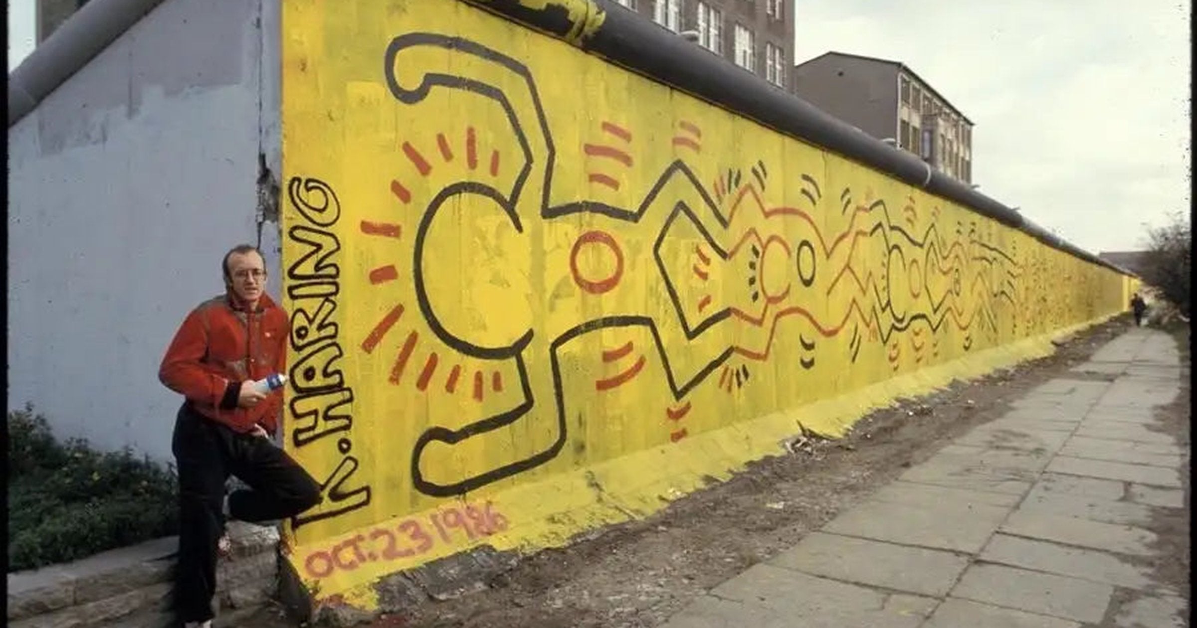
Haring described the project as an attempt to undermine the Wall psychologically through painting, recognising the symbolic possibilities of working on the barrier itself. His choice to wear a Free South Africa T-shirt during the accompanying press conference connected the occasion with another struggle against oppression.
Although the mural was soon painted over, photographs preserve a public act whose importance lay partly in the moment of its creation and the attention it brought to the site.
Giving Children a Place in the Picture
Haring’s activism also took practical form through workshops, donations and projects made with children. His public work included murals for hospitals and community settings, bringing art into places where it could contribute to people’s daily experience.
For a mural celebrating the Statue of Liberty’s centenary in 1986, he worked with hundreds of children, giving their participation a place within a project associated with freedom and public identity. Elsewhere, workshops allowed young people to draw alongside an internationally recognised artist and contribute their own ideas.

This approach extended his concern with access beyond the opportunity to look at an image. Taking part could give children a sense of ownership and confidence, making the process of creating something together an important part of the project.
The same interest in reaching people shaped his decision to open the Pop Shop, although its commercial format provoked a different debate. Our article on why Keith Haring opened the Pop Shop examines how he sought to maintain that public connection as his work became increasingly valuable.
The Work Goes On
Haring established the Keith Haring Foundation in 1989, creating a means for his support of children’s programmes and HIV/AIDS-related organisations to continue after his death. Its work gave lasting practical expression to concerns he had pursued through images, fundraising and personal involvement.
For collectors, this history adds substance to the encounter with his prints. A familiar figure may belong to a specific campaign, while a scene of affection or confrontation can carry associations shaped by the social conditions in which it was made. Understanding those circumstances helps explain both the work’s immediate appeal and its place in Haring’s career.
Our guide to collecting Keith Haring prints introduces the principal editions and the considerations involved in choosing a work.
Haring’s achievement was to make demanding subjects accessible without draining them of urgency. His art could welcome viewers through humour, colour and recognition, then ask them to confront something uncomfortable, acknowledge another person’s experience or consider their own responsibility to act.
To explore Keith Haring prints for sale, or to discuss selling a Keith Haring print, contact our team at info@alexyellop.com.